Map
Introduction
In the GIS environment, the most familiar model is a map. A map is a miniature representation of a part of the real world.
Board (1990) defines a map as “a representation or abstraction of geographic reality. A tool for presenting geographic information in a way that is visual, digital or tactile.” The first sentence in this definition contains three key words. The “geographic reality” represents the object of study: i.e. our world. “Representation” and “abstraction” refer to models of these geographic phenomena. The second sentence reflects the appearance of the map. Can we see or touch it? Or is it stored in a database? In other words, a map is a reduced and simplified representation of the Earth’s surface, or parts of it, on a plane.
Maps can deal with questions/answers related to the basic components of spatial or geographic data: location (geometry), characteristics (thematic attributes) and time, and combinations thereof. As such, maps are the most efficient and effective means of transferring spatial information. The map user can locate geographic objects, while the shape and colour of signs and symbols representing the objects inform about their characteristics. They reveal spatial relations and patterns and offer the user insight into and overview of the distribution of particular phenomena. An additional characteristic of on-screen maps is that these are often interactive and have a link to a database; this allows for more complex queries.
Explanation
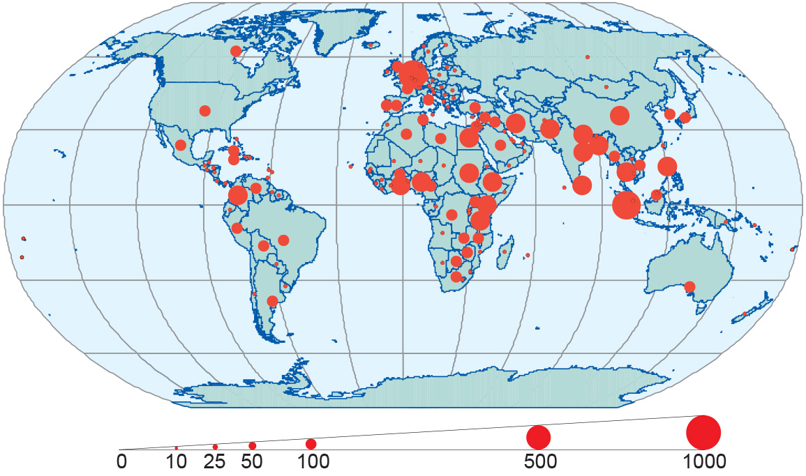
There is a strong relationship between maps and GISs. Maps play a role at any moment one uses a GIS. They can be used as input, to verify data, to prepare a spatial analysis and of course to present results. As soon as a “where?” crops up in a question, a map can often be the most suitable tool for solving the question and providing the answer. “Where do I find Enschede?” and “Where do ITC’s students come from?” are both examples. Of course, the answers could be in non-map form, such as “in the Netherlands” or “from all over the world”. These answers could be satisfying enough. However, it is clear that these answers do not give a full picture. A map would put these answers in a spatial context. It could show where in the Netherlands Enschede is to be found and where it is located with respect to Schiphol Amsterdam airport, where most students arrive when they come to the Netherlands. A world map would refine the answer “from all over the world,” since it reveals that most students come from Africa and Asia, and only a few come from the Americas, Australia and Europe, as can be seen in Figure 1.
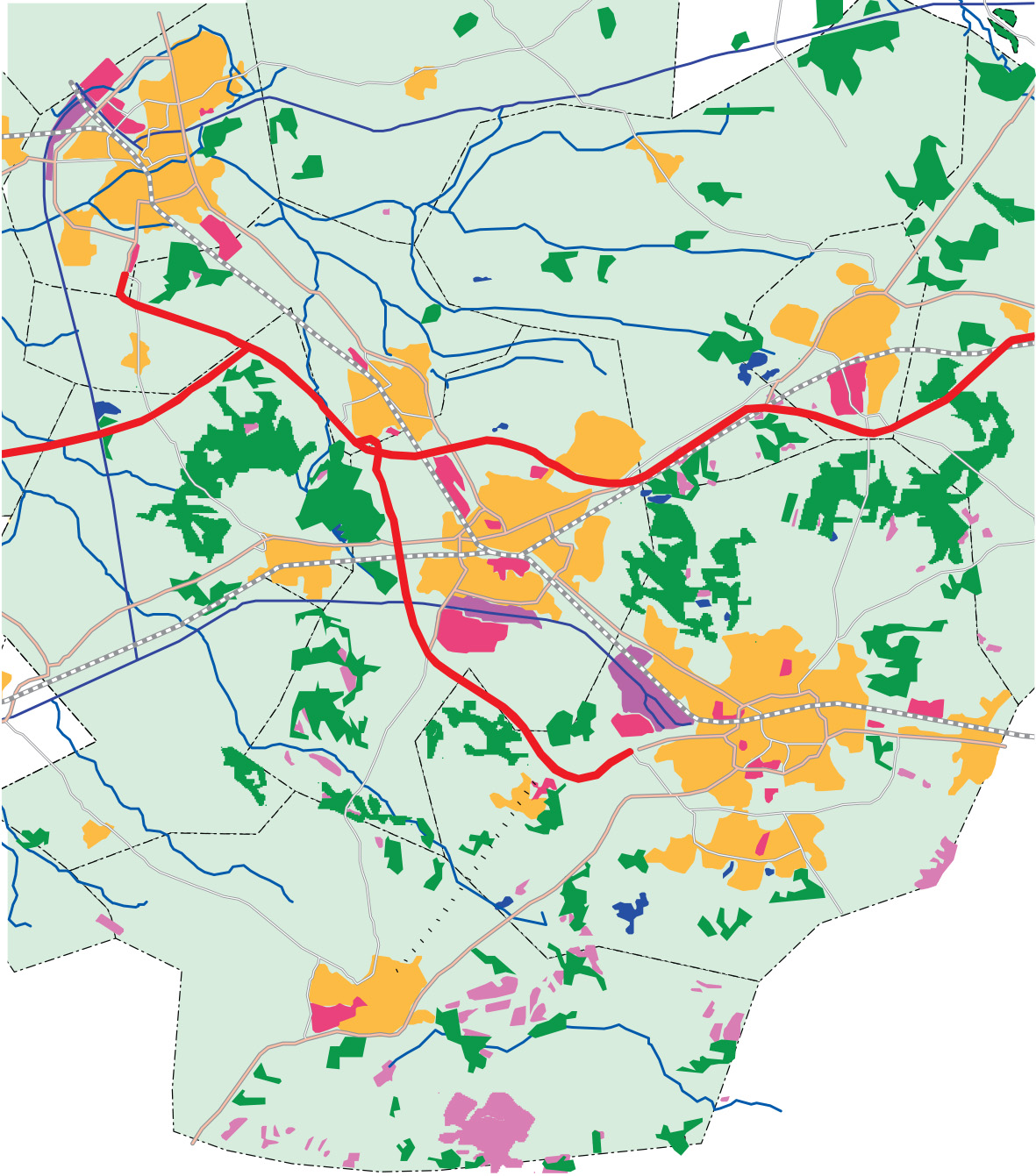
As soon as the location of geographic objects is involved (“where?”), a map becomes useful. However, maps can do more than just provide information on location. They can also inform about the thematic attributes of the geographic objects to be found in them. An example would be “What is the predominant land use in southeast Twente?” The answer could, again, be just verbal and state “Urban.” However, such an answer does not reveal patterns of land use. In Figure 2, a dominant northwest–southeast urban buffer can be clearly distinguished. Maps can answer the “What?” question only in relation to location (the map as a reference frame).
A third type of question that can be answered from maps is related to “When?” For instance, “When did the Netherlands have its longest coastline?” The answer might be “1600,” and this would probably be satisfactory for most people. However, it might be interesting to see how this has changed over the years. A set of maps as demonstrated in Figure 3 could provide the answer.
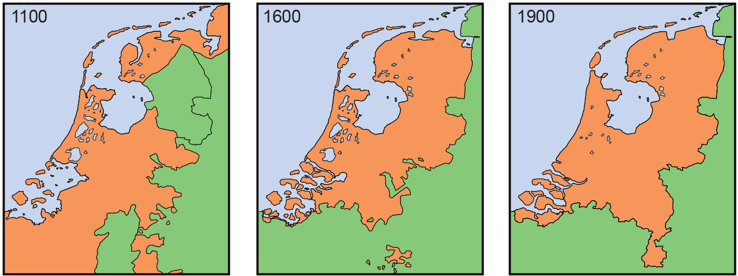
Looking at these three sets of maps demonstrates an important quality of maps: the ability to offer an abstraction of reality. A map simplifies by leaving out certain details, map as a model but at the same time, when well designed, it puts the remaining information in a clear perspective. The map in Figure 1 only needs the boundaries of countries and a symbol to represent the number of students per country. In this particular case, there is no need to show cities, mountains, rivers or other phenomena.
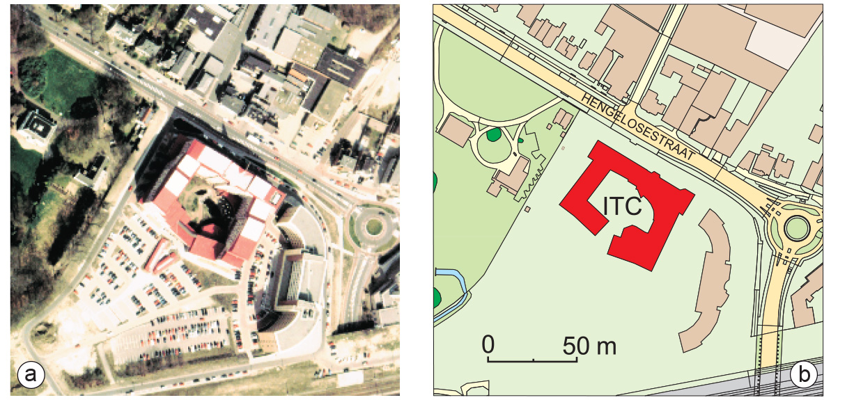
This characteristic is well illustrated when one puts a map next to an aerial photograph or satellite image of the same area. Products such as the latter give all information observed by the capturing devices used. Figure 4 shows an aerial photograph of the ITC building and a map of the same area. The photograph shows all visible objects, including parked cars and small temporary buildings. From the photograph, it becomes clear that the weather, as well as the time of day, has had an influence on its contents: the shadow to the north of the buildings obscures other information. The map on the other hand, only gives the outlines of buildings and the surrounding streets. It is easier to interpret because of the selection/omission and classification of features. The symbolization chosen highlights the ITC building. Additional information, not available in the photograph, has been added, such as the name of the main street: Hengelosestraat. Other non-visible data, such as cadastral boundaries or even the sewerage system, could have been added in the same way. However, this also demonstrates that selection means interpretation, and there are subjective aspects to that. In certain circumstances, a combination of photographs and map elements can be useful.
External resources
- Board, C.(1990). Report of the working group on cartographic definitions. Cartographic Journal, 29(1), 65–69.
Prior knowledge
Outgoing relations
- Map is a kind of Model
- Map is a kind of Visualization
- Map is based on Map design
Incoming relations
- Map scale is a property of Map
- Map type is a property of Map
- Map element is part of Map
- Map symbol is part of Map