Cartographic communication
Introduction
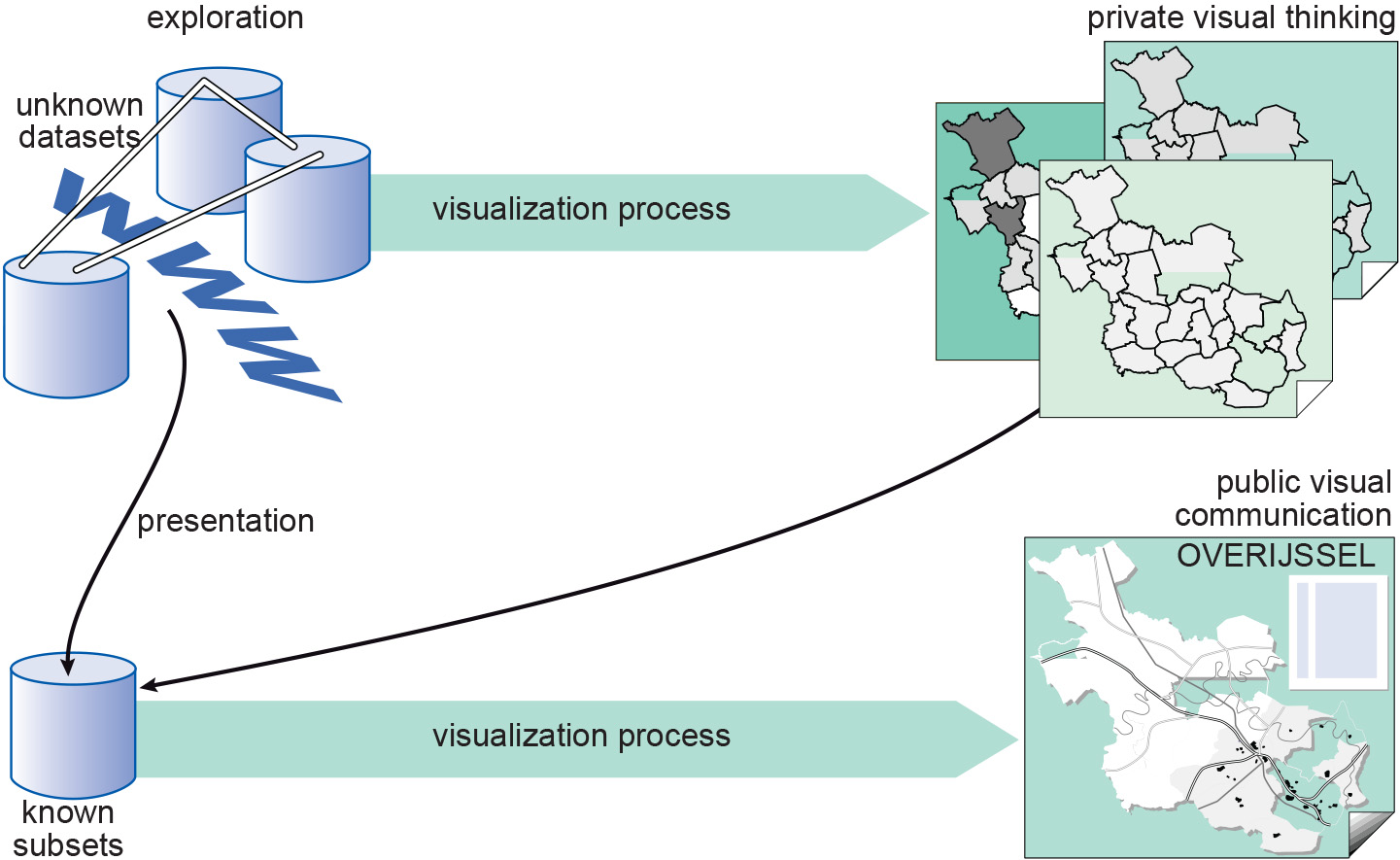
To create a map, one selects relevant geographic data and converts these into meaningful symbols for the map. In the past, printed maps had a dual function. They acted as a database of the objects selected from reality, and they communicated information about those geographic objects. The introduction of computer technology and databases, in particular, has created a split between these two functions of the map. The database function is no longer required for the map, although each map can still function like a database. The communication function of maps has not changed.
The sentence “How do I say what to whom, and is it effective?” guides the cartographic visualization process and summarizes the cartographic communication principle. Especially when dealing with maps in the realm of presentation cartography, it is important to adhere to cartographic design rules. This is to guarantee that the resulting maps are easily understood by their users.
Explanation
How does this communication process work? Well, see Figure 2. The process starts with information to be mapped (the “What” from the sentence). Before anything can be done, the cartographer should get a feel for the nature of the information, since this determines the graphical options; cartographic information analysis provides that feel. From this knowledge, the cartographer can choose the correct symbols to represent the information in the map. Cartographers have a whole toolbox of visual variables available to match symbols with the nature of the data.
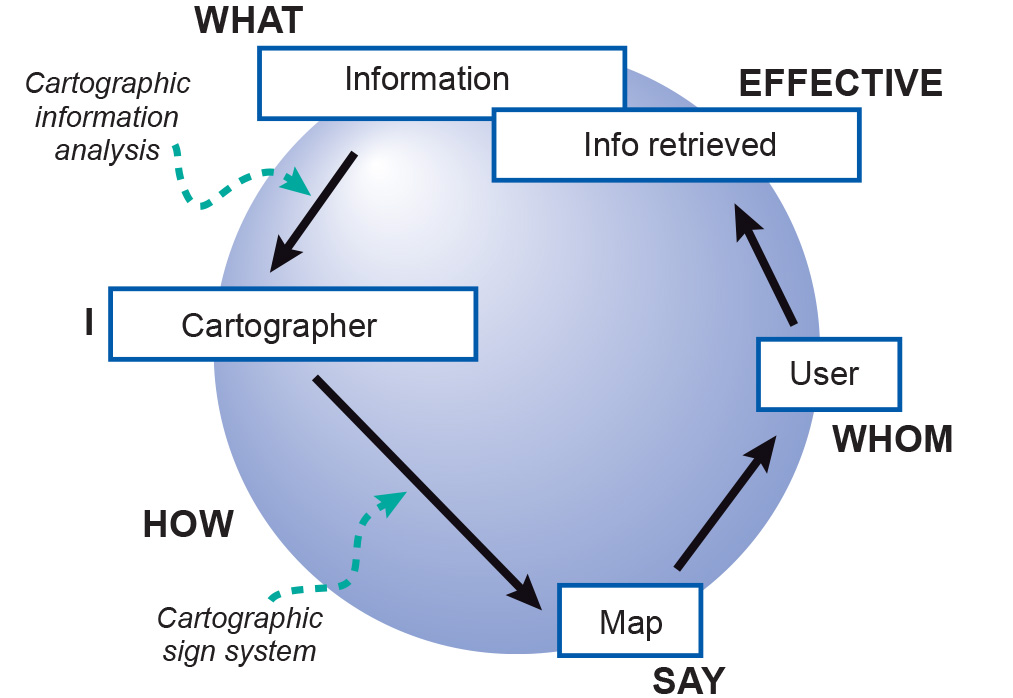
In 1967, the French cartographer Bertin published the basic concepts of the theory of map design in his book Sémiologie Graphique (Bertin (1967)). He provided guidelines for making good maps. Nevertheless, if 10 professional cartographers were given the same mapping task and each were to apply Bertin’s rules, this would still result in 10 different maps. For instance, if the guidelines dictate the use of colour, it is not stated which colours should be used. Still, all 10 maps could be of good quality.
Returning to the scheme, the map (the medium that does the “say” in our sentence above) is read by the map users (the “whom” from the sentence). They extract some information from the map, represented by the box entitled “Info retrieved”. From the figure it becomes clear that the boxes with “Information” and “Info retrieved” do not overlap. This means the information derived by the map user is not the same as the information that the cartographic communication process started with.
There may be several causes for this. Perhaps all the original information was not used or perhaps additional information was added during the process. Perhaps the cartographer deliberately omitted information with the aim of emphasizing the remaining information. Another possibility is that the map user does not understand the map fully. Information gained during the communication process could be the result of the cartographer adding extra information to strengthen the information already available. It is also possible that the map user has some prior knowledge on the topic or area, which would allow him or her to combine this prior knowledge with knowledge retrieved from the map.
External resources
- Bertin, J. (1967). Sémiology Graphique. The Hague, The Netherlands: Mouton.
Incoming relations
- Map design is based on Cartographic communication