Mapping of quantitative data
Introduction
If, after executing a census, one would like to create a map of the number of people living in each municipality, one would be dealing with absolute quantitative data. The geographic units will logically be the municipalities. The final map should allow the user to determine the amount per municipality and also offer an overview of the geographic distribution of the phenomenon. To achieve this objective, the symbols used should possess properties that facilitate quantitative perception. Symbols varying in size would fulfill this demand. Figure 1 shows the final map of inhabitants in the province of Overijssel.

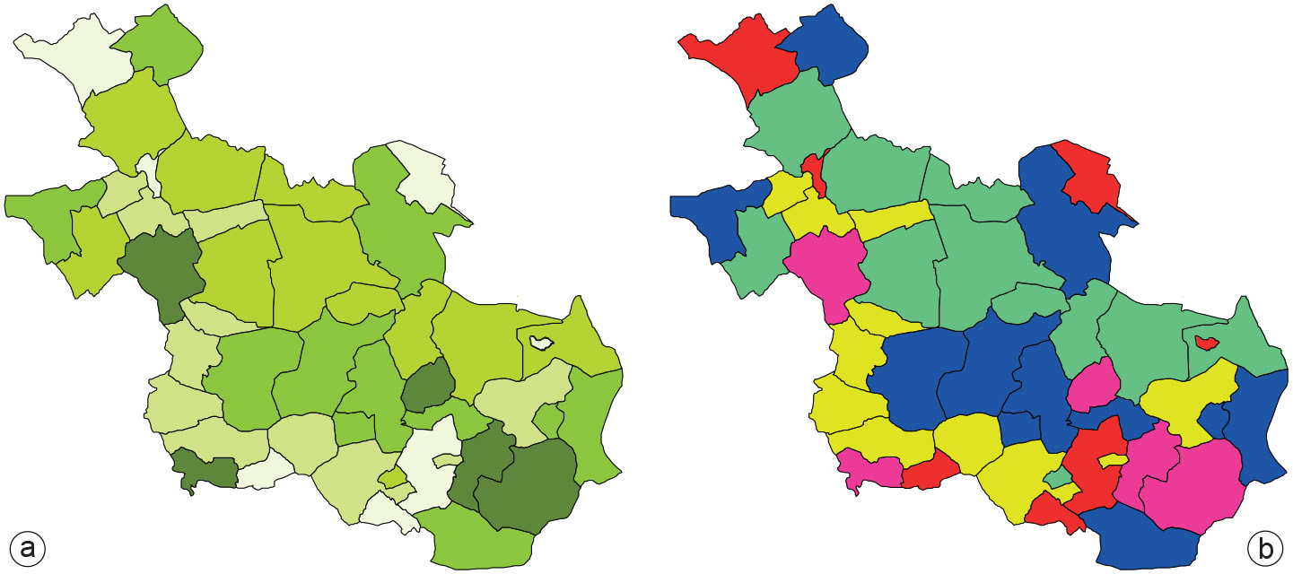
The fact that it is easy to make errors can be seen in Figure 2. In Figure 2a, different tints of green (the visual variable “value”) have been used to represent absolute population numbers. The reader might get a reasonable impression of the individual amounts but not of the actual geographic distribution of the population, as the size of the geographic units will influence the perceptional properties too much. Imagine a small and a large unit having the same number of inhabitants. The large unit would visually attract more attention, giving the impression there are more people than in the small unit. Another issue is that the population is not necessarily homogeneously distributed within the geographic units.
Colour has also been misused in Figure 2b. The four-colour scheme applied makes it is impossible to infer whether red represents more-populated areas than blue. It is impossible to instantaneously answer a question like “Where do most people in Overijssel live?”
On the basis of absolute population numbers per municipality and their geographic size, we can also generate a map that shows population density per municipality. We are then dealing with relative quantitative data. The numbers now have a clear relation with the area they represent. The geographic unit will again be “municipality”. The aim of the map is to give an overview of the distribution of the population density. In the map of Figure 3, value has been used to display the density from low (light tints) to high (dark tints). The map reader will automatically, at a glance, associate the dark colours with high density and the light colours with low density.

Figure 4a shows the effect of incorrect application of the visual variable “value”. In this map, the value tints are out of sequence. The user has to go to quite some trouble to find out where in the province the high-density areas can be found. Why should the lighter, mahogany-red represent areas with a higher population density than darker, burgundy-red. In Figure 4b colour has been used in combination with value. The first impression of the map reader would be to think that the brown areas represent those areas with the highest density. A closer look at a legend would tell you that this is not the case and that those areas are represented by another colour that does not “speak for itself”.
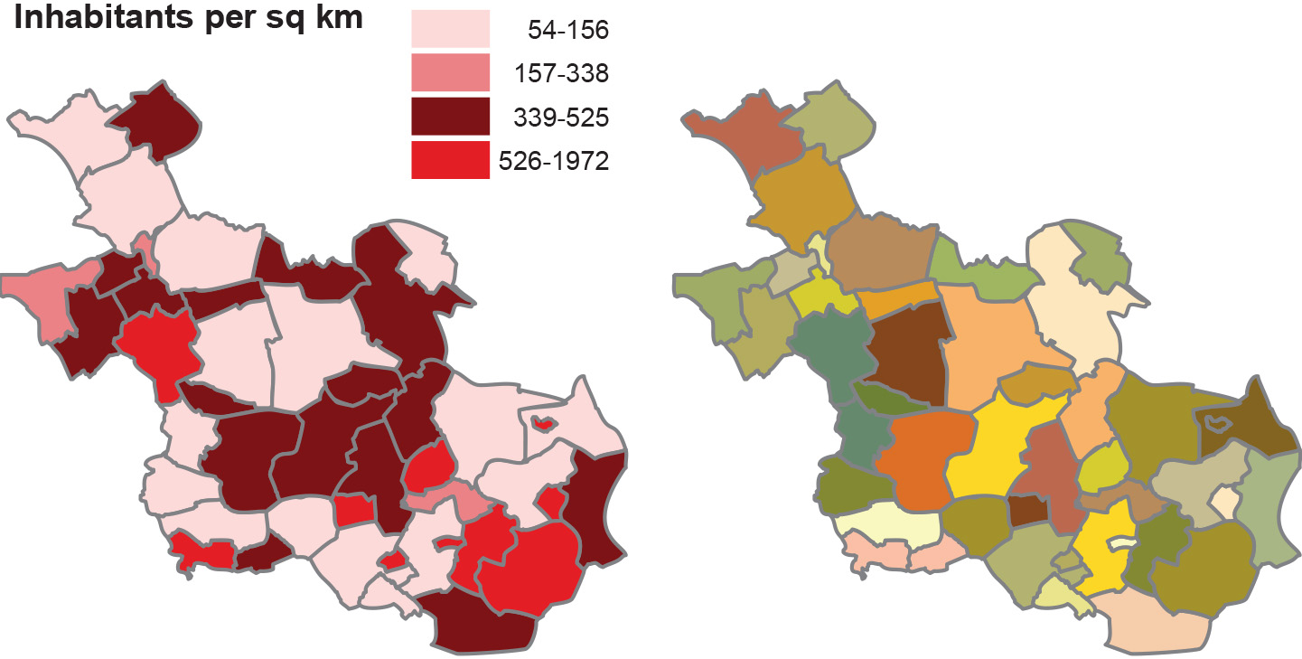
If one studies the poorly designed maps carefully, the information can be derived in one way or another, but it takes quite some effort to do so. Proper application of cartographic guidelines guarantee that this will go much more smoothly (e.g. faster and with less chance of misunderstanding).
Prior knowledge
Outgoing relations
- Mapping of quantitative data is defined by Data characteristics in mapping