Mapping of qualitative data
Introduction
If, after a long period of fieldwork, someone has finally delineated the boundaries of a province’s watersheds, probably they will be interested in making a map showing these areas. The geographic units in the map will have to represent the individual watersheds. In such a map, each of the watersheds should get equal attention; none should stand out above the others.
The application of colour would be the best solution since is has characteristics that allow one to quickly differentiate between different geographic units. However, since none of the watersheds is more important than the others, the colours used have to be of equal visual weight or brightness. Figure 1 gives an example of a map in which colour has been used correctly. The readability is influenced by the number of displayed geographic units. In this example, there are about 15. When this number is much higher, the map, at the scale displayed here, will become too cluttered. The map can also be made by depicting the watershed areas with different forms (small circles, squares, triangles, etc.) in one colour (e.g. black for a monochrome map)—as an application of the visual variable “shape”. The amount of geographic units that can be displayed is then even more critical.
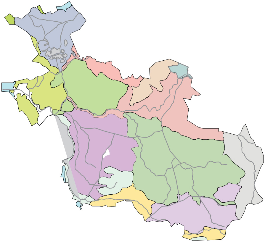
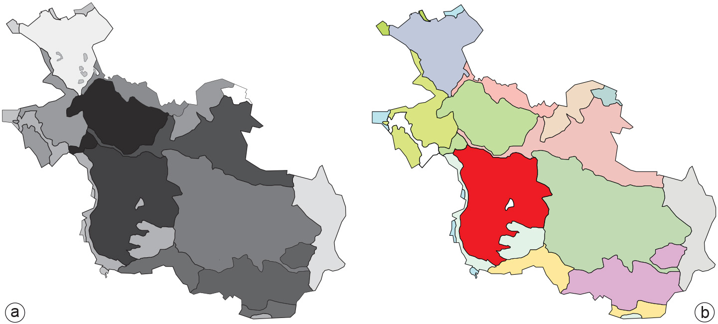
Figure 2 shows two examples of how not to create such a map. In (a), several tints of black are used—as an application of the visual variable “value”. Looking at the map may cause perceptual confusion since the map image suggests differences in importance that are not there in reality. In Figure 2b, colours are used instead. However, where most watersheds are represented in pastel tints, one of them stands out because of its bright colour. This gives the map an unbalanced look. The viewer’s eye will be distracted by the bright colours, resulting in unjustified weaker attention for other areas.
Prior knowledge
Outgoing relations
- Mapping of qualitative data is defined by Data characteristics in mapping