Graduated Symbol Map
A type of thematic map in which the size of features and/or their symbols is varied to represent an attribute.
Introduction
In Jacques Bertin's system of visual variables, _size_ is commonly recognized as one of the most intuitive for visually portraying a sense of "more" and "less," especially quantitative attributes such as total population. Usually, this term is used for a map that uses point symbols that vary in size (which would more properly called a _proportional point symbol map_). That said, maps that vary size in lines (such as line weight in a flow map) or regions (a _cartogram_) can be considered closely related.
Explanation
Creating a proportional point symbol map involves three choices: the variable, the symbol, and the scaling. Variable: Proportional symbol maps can represent a wide variety of quantitative attributes, but not all are equally appropriate. Because map readers will naturally compare the relative sizes of different features and assume that the visual variation is proportional to the attribute variation (that is, a symbol being twice as large as another means the value is twice as large), the best variables will be ratio in Stevens' scales of measurement, without the possibility of negative values (since they could not be shown). Within this constraint, variables that represent total counts or amounts are especially conducive to this method because they will more intuitively interpreted. Variables that exhibit a moderately high degree of variation (a ratio between the largest to smallest values of 100:1 to 1,000:1) appear to be most useful in judging relative size. Symbol: Any point symbol could be used, but most map readers can more accurately judge the size of simple shapes such as circles or squares than complex iconic symbols.

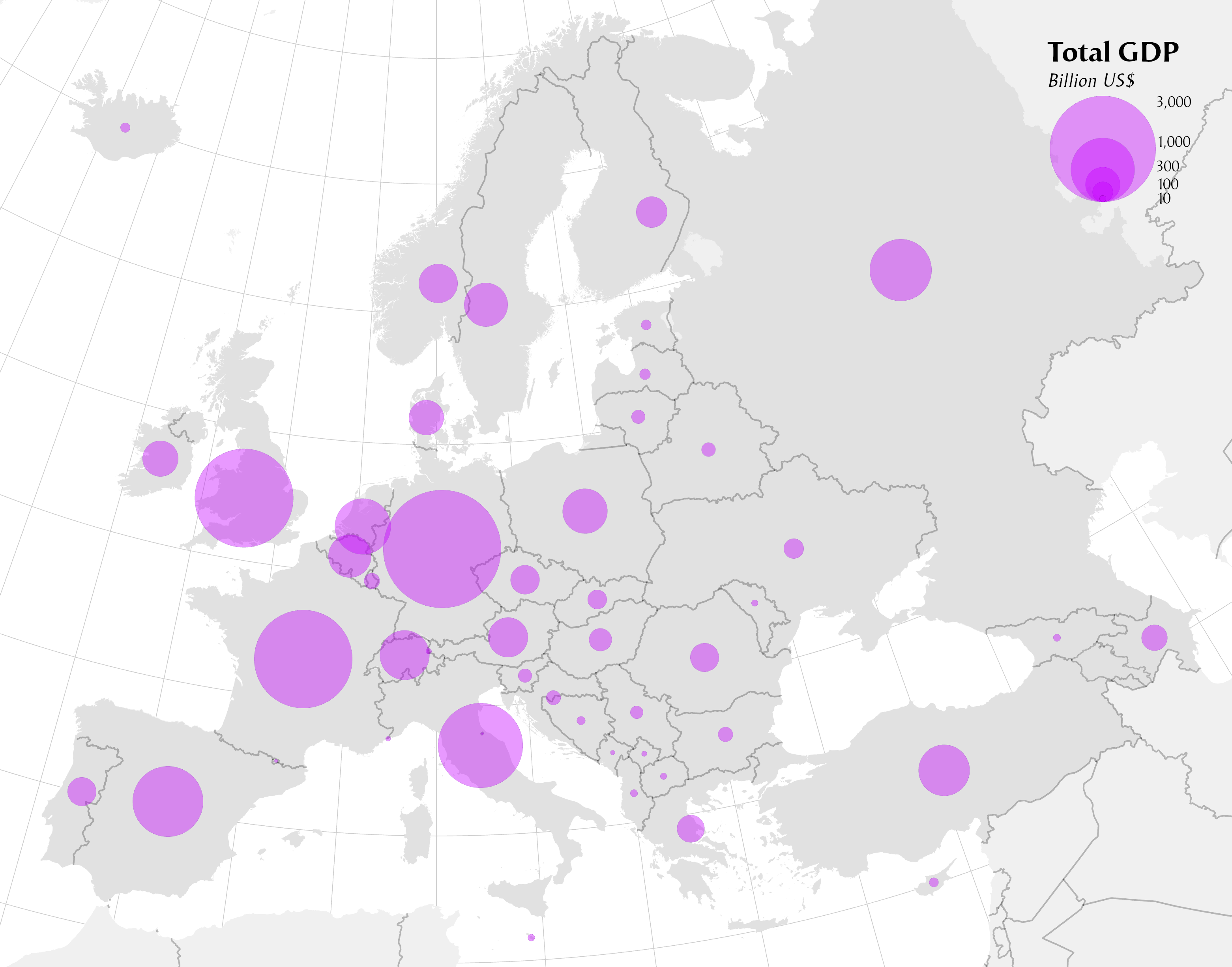
Figure 1: a proportional point symbol map of total GDP in Europe
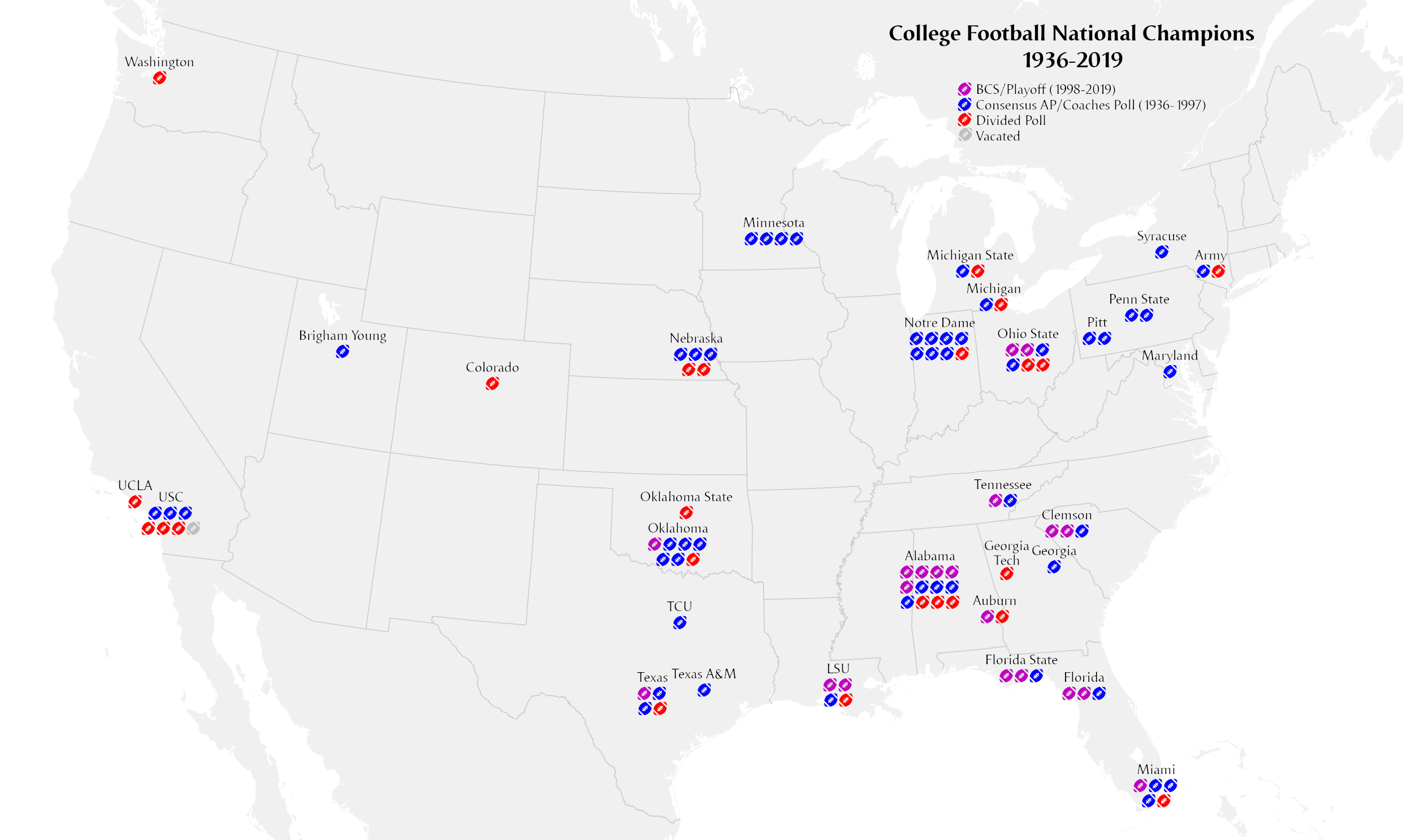
An _isotype_ map is a special type of symbology that uses a cluster of small symbols to represent a total number of individuals.

Figure 2: an isotype proportional map of the number of NCAA college football championships
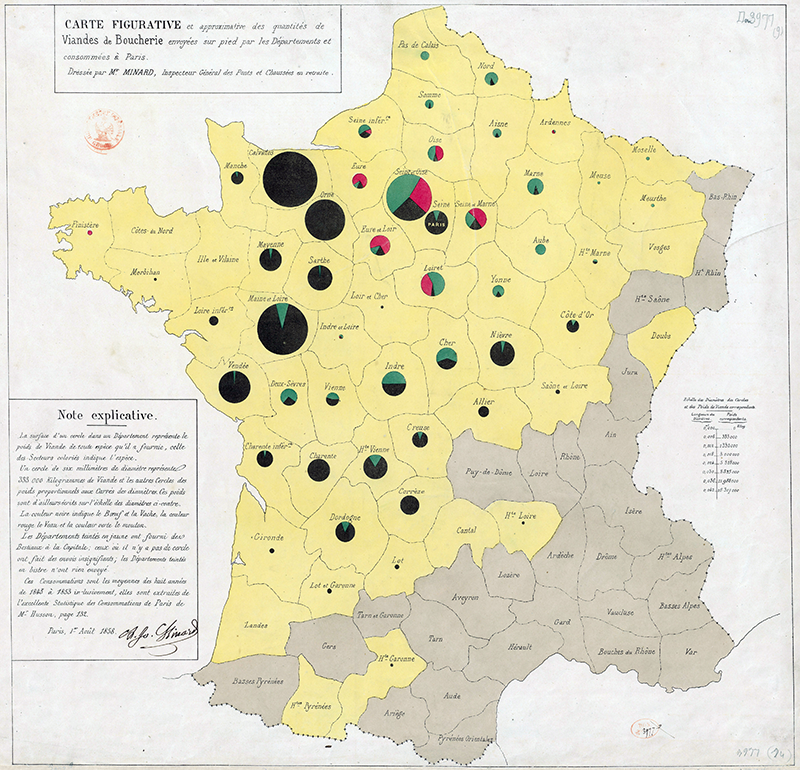
Another option is to use a chart (e.g., a pie chart) as the symbol, with the overall size being proportional to the total.

Figure 3: An 1858 map by Charles Joseph Minard of meat production in France, one of the earliest proportional point symbol maps, and possibly the first to use proportional pie charts. [public domain]
A third option is to use a secondary visual variable, such as color, to represent another variable. Scaling: Typically, the symbols are scaled such that their areas are directly proportional to their values, that is . For a circle symbol, the radius would thus be proportional to the square root of the values:
. Psychophysical experiments, starting with James Flannery in 1956, have found that map readers typically judge relative area inaccurately. For circles, Flannery proposed compensating for this by increasing the ratio exponent from 0.5 to 0.5716.
Examples
- GDP per capita is a technically appropriate variable, but total GDP would likely have less misinterpretation.
- Proportion of population speaking Hungarian would be allowable, total number of Hungarian speakers would be better.
How to
Most geographic information system software, including cloud-based GIS and web mapping platforms, have tools for creating proportional symbol maps automatically by scaling a chosen symbol by a given attribute, with some control over the scaling parameters.
Synonyms
Proportional point symbol maps
External resources
- About Proportional symbol maps on Wikipedia
- Design textbooks (Dent et al, Kraak and Ormeling, Slocum et al, Robinson)
Learning outcomes
-
7 - Learning outcomes - proportional sysmbol map
- Classify a potential attribute as either
a) inappropriate
b) somewhat appropriate
c) highly appropriate for representation using the proportional symbol technique. - Design an effective proportional point symbol map (including the legend) that effectively visualizes variation in an attribute with a desired aesthetic appeal.
- Classify a potential attribute as either
Prior knowledge
Outgoing relations
- Graduated Symbol Map is subconcept of Thematic map
Incoming relations
- Proportional Symbol Map is same as Graduated Symbol Map
Contributors
-
Brandon Plewe
http://carto.byu.edu