Choropleth map
A choropleth map is a type of thematic map that uses shaded or colored areas to represent data values across predefined geographic regions, such as countries, states, or districts. The color intensity or pattern corresponds to the magnitude of a statistical variable, making it easy to visualize spatial patterns and distributions.
Introduction
A choropleth map is a thematic map that shades enumeration units by
their attribute values. Choropleth maps represent quantitative,enumerated data and
rely on the visual variable colour value to create a visual order from light-to-dark
colours or from dark-to-light colours when using a dark background. They also employ colour
hue and colour saturation in multi-hued spectral schemes and all diverging schemes.
Key Characteristics of a Choropleth Map:
- Uses color gradients or distinct shades to represent different values.
- Displays data aggregated by geographic boundaries (e.g., census tracts, provinces).
- Best suited for normalized data (e.g., percentages, rates, densities) rather than raw counts.
Explanation
Common Applications of Choropleth Maps:
- Population Density Mapping – Visualizing people per square kilometer in different regions.
- Economic Data Representation – Mapping GDP per capita or unemployment rates.
- Epidemiology & Health Studies – Showing disease prevalence across regions.
- Election Results Visualization – Depicting voter turnout or party dominance by state.
- Climate & Environmental Data – Displaying temperature variations or pollution levels.
Examples
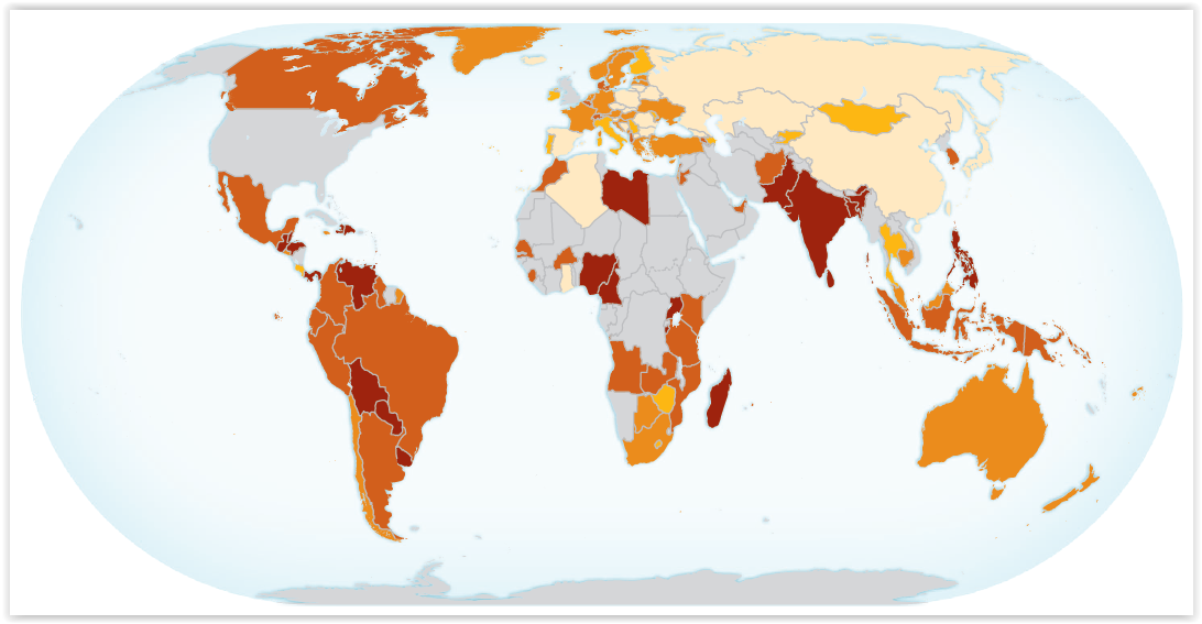
Choropleth map of Unsentenced Detainees as Percentage of Total Prison Population
Prior knowledge
Outgoing relations
- Choropleth map is subconcept of Thematic map
Incoming relations
- Classification is subconcept of Choropleth map