Mapping of elevation
Introduction
Terrain elevation can be mapped using various methods. Often, one will have collected an elevation data set for individual points such as peaks, or other characteristic points in the terrain. Obviously, one can map the individual points and add the height information as text. However, a contour map, in which the contour lines connect points of equal elevation, is generally used. To visually improve the information content of such a map, the space between the contour lines can be filled with colour and value information following a convention, e.g. green for low elevation and brown for areas of high elevation. This technique is known as hypsometric or layer tinting.
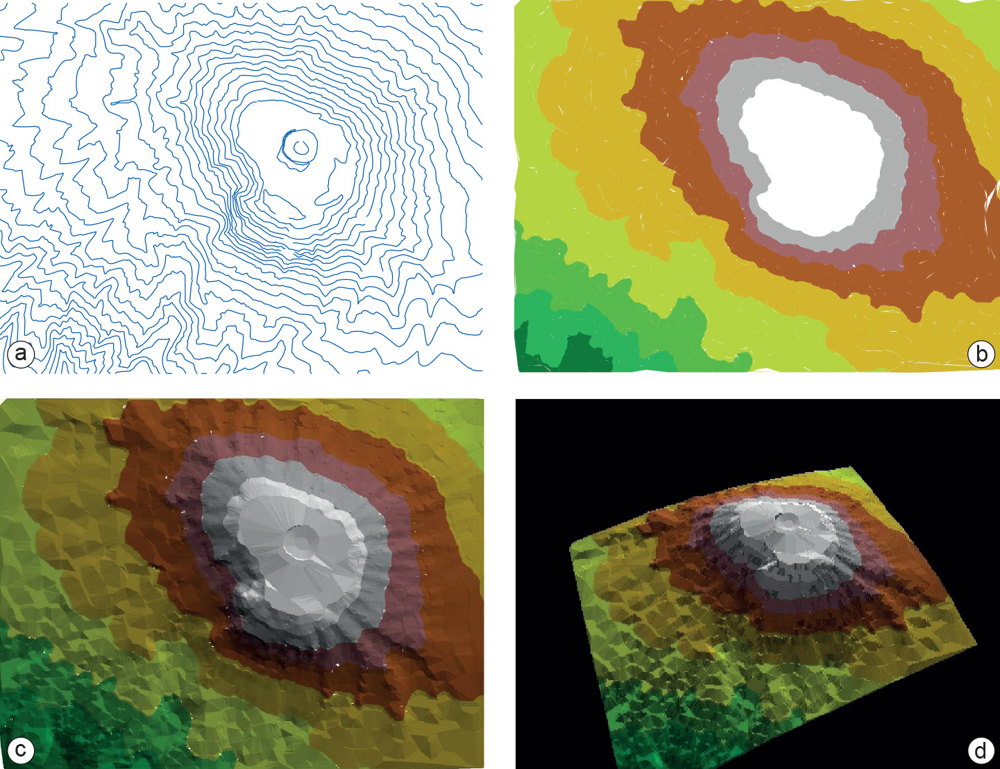
Even more advanced is the addition of shaded relief. This will improve the impression of three-dimensional relief (see Figure 1). The shaded-relief map uses all three-dimensional information available to create shading effects. This map, represented on a two-dimensional surface, can also be floated in three-dimensional space to give it the real three-dimensional appearance of a “virtual world”, as shown in Figure 1d. Looking at such a representation, one can immediately imagine that it will not always be effective. Certain (low) objects in the map will easily disappear behind other (higher) objects. Interactive functions are required to manipulate the map in three-dimensional space in order to look behind some objects. These manipulations include panning, zooming, rotating and scaling.
Scaling is needed particularly along the z-axis since some maps require small-scale elevation resolution, while other require large-scale resolution, i.e. vertical exaggeration. One can even imagine that other geographic, three-dimensional objects (for instance, the built-up area of a city and individual houses) have been placed on top of the terrain model, as is done in Google Earth. Of course, one can also visualize objects below the surface in a similar way, but this is more difficult because the data to describe underground objects are sparse.

Socio-economic data can also be viewed in three dimensions. This may result in dramatic images that will be long remembered by the map user. Figure 2 shows the absolute population figures of Overijssel in three dimensions. Instead of using proportionally sized circles to depict the number of people living in a municipality (as we did in How to map qualitative data), the proportional height of a municipality now indicates total population. The image clearly shows that the municipality of Enschede (the largest column to the lower right) has by far the highest population.
Prior knowledge
Outgoing relations
- Mapping of elevation is defined by Data characteristics in mapping
Incoming relations
- Set of coordinates is part of Mapping of elevation