Mapping of time series
Introduction
The third dimension of GIS routines is no longer reserved solely for advanced handling of spatial data. Nowadays, the handling of time-dependent data is also a feature of these routines, a consequence of the increasing availability of data captured at different periods in time. In addition to this abundance of data, the GIS community wants to analyse changes caused by real-world processes. To that end, single time-slices of data are no longer sufficient and the visualization of these processes cannot be supported by only static, printed maps.
Explanation
Mapping time means mapping change. This may be change in a feature’s geometry, in its attributes, or both. Examples of changing geometry are the evolving coastline of the Netherlands, the location of Europe’s national boundaries, or the position of weather fronts. Changes in the ownership of a land parcel, in land use or in road traffic intensity are other examples of changing attributes. Urban growth is a combination of both: urban boundaries expand with growth and simultaneously land use shifts from rural to urban. If maps are to represent events like these, they should be suggestive of such change.
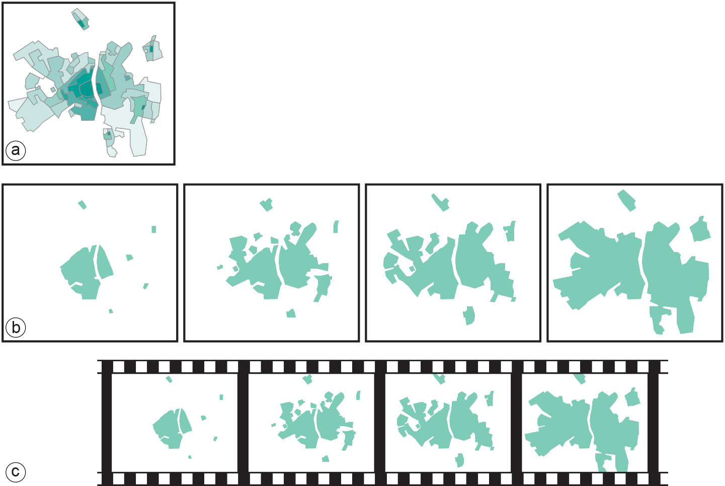
Three temporal cartographic techniques can be distinguished (see Figure below):
Single Static Map
Specific graphic variables and symbols are used to indicate change or represent an event. Figure a applies the visual variable “value” to represent the age of built-up areas.
Series of Static Maps
A single map in the series represents a “snapshot” in time. Together, the maps depict a process of change. Change is perceived by the succession of individual maps depicting the situation in successive snapshots. It could be said that the temporal sequence is represented by a spatial sequence that the user has to follow to perceive the temporal variation. The number of images should be limited since it is difficult for the human eye to follow long series of maps (Figure b)
Animated Maps
Change is perceived to evolve in a single image by displaying several snapshots one after the other, just like a video clip of successive frames. The difference from the series of maps is that the variation can be deduced from real “change” seen taking place in the image itself, not from a spatial sequence (Figure c). For the user of a cartographic animation, it is important to have tools available that allow for interaction while viewing the animation. Seeing an animation play will often leave users with many questions about what they have seen. And just replaying the animation is not sufficient to answer questions like “What was the position of the northern coastline during the 15th century?” Most of the general software packages for viewing animations already offer facilities such as “pause” (to look at a particular frame) and ‘(fast-)forward’ and ‘(fast-)backward’, or step-by-step display. More options have to be added, such as the possibility to go directly to a certain frame based on a task command like: “Go to 1850”.
Examples
Suggestion of change implies the use of symbols that are perceived as representing change. Examples of such symbols are arrows that have an origin and a destination. These are used to show movement and their size can be an indication of the magnitude of change. Size changes can also be applied to other point and line symbols to show increase and decrease over time. Specific point symbols such as “crossed swords” (battle) or “lightning” (riots) can be found to represent dynamics in historic maps. Another alternative is the use of the visual variable value (expressed as tints). In a map showing the development of a town, dark tints represent old built-up areas, while new built-up areas are represented by light tints Figure a.
Prior knowledge
Outgoing relations
- Mapping of time series is defined by Data characteristics in mapping